Mobile-first design is a design approach that prioritizes creating the user experience and interface design for mobile devices first, before considering the design for larger screens like desktops or tablets. This approach recognizes the growing prevalence of mobile devices and the importance of providing a seamless and optimized experience for users accessing websites and applications on smaller screens.
Here are the key principles and benefits of mobile-first design:
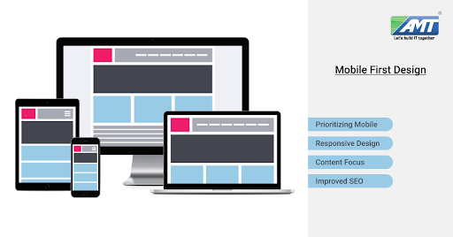
- Prioritizing Mobile: Designers start by creating the user interface and experience for mobile devices. This forces them to focus on the most essential features and content due to the limited screen space.
- Responsive Design: After creating the mobile version, the design is then scaled up for larger screens using responsive design techniques. This ensures that the design adapts and looks good across a variety of screen sizes and resolutions.
- Performance Optimization: Mobile-first design encourages optimizing images, code, and other elements for smaller screens, which can lead to improved loading times and overall performance for all devices.
- Content Focus: The limited space on mobile screens forces designers to prioritize content and features, leading to a more streamlined and user-focused design.
- Progressive Enhancement: As the design is expanded to larger screens, additional features and enhancements can be added, providing a richer experience for users with more capable devices.
- Improved SEO: Google and other search engines prioritize mobile-friendly websites in their rankings. Designing with a mobile-first approach can lead to better search engine optimization (SEO) results.
- User-Centric Approach: Mobile devices are often used in different contexts and environments, making it crucial to design with the user’s needs and preferences in mind.
- Future-Proofing: With the increasing diversity of devices, including foldable phones and wearable devices, starting with a mobile-first approach ensures that the design is adaptable to new technologies.
- Simplicity and Clarity: Mobile-first design encourages simplicity and clear visual hierarchy, which can enhance the user experience across all devices.
- Iterative Design Process: Following a mobile-first approach encourages an iterative design process, where designers continuously refine and improve the design as it’s scaled up to larger screens.
Mobile-first design is especially relevant as mobile device usage continues to grow globally. It emphasizes the importance of providing a seamless and engaging experience for users, regardless of the device they use to access your website or application.
here’s some additional information about mobile-first design:
Design Principles:
- Thumb-Friendly Design: Mobile-first design considers the ease of navigation and interaction using thumbs, as most users hold their phones with one hand and interact primarily using their thumbs.
- Touch-Friendly Elements: Designing with touch interactions in mind ensures that buttons and interactive elements are appropriately sized and spaced for accurate tapping.
- Minimalist Approach: Due to limited screen real estate, designers are encouraged to prioritize essential content and avoid clutter, leading to a cleaner and more focused design.
- Vertical Layout: Mobile screens are taller than they are wide, so mobile-first designs often utilize vertical scrolling to present content, making it a natural fit for the user’s reading behavior.
Development Considerations:
- Mobile-First CSS: Using mobile-first CSS means designing the base styles for mobile devices and then using media queries to add styles for larger screens. This can help optimize loading times for mobile users.
- Performance Optimization: Mobile-first design promotes performance optimization, which is crucial for mobile devices with varying network speeds and data constraints.
- Flexible Images: Implementing responsive images that adapt to different screen sizes and resolutions is important for providing a visually pleasing experience on all devices.
- Fluid Grids: Using fluid grids allows content to adapt to different screen sizes, ensuring a consistent and balanced layout across devices.
Challenges and Considerations:
- Feature Prioritization: Designing for mobile first forces a critical assessment of features, helping to prioritize what’s most important for users.
- Complex Interactions: Some complex interactions and features might need adaptation for smaller screens. This might require creative solutions or even omitting certain features from mobile versions.
- Content Parity: While focusing on mobile-first, it’s important to ensure that essential content and features are also available on larger screens to maintain consistency.
- Testing Across Devices: Ensuring that the design works well on a wide range of devices and screen sizes requires thorough testing and iteration.
In conclusion, mobile-first design is a strategic approach that recognizes the dominant role of mobile devices in users’ lives. By starting the design process with mobile devices in mind, designers and developers can create more user-centric, efficient, and adaptable digital experiences that cater to a diverse range of devices and user contexts.
Watch this space for more updates on the latest trends in Technology.