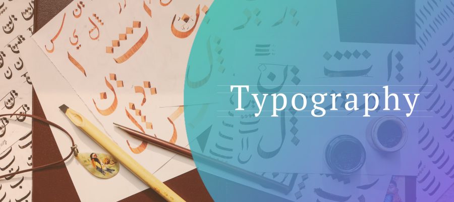
Typography is the art and technique of arranging type to make written language legible, readable and appealing when displayed. The arrangement of type involves selecting typefaces, point sizes, line lengths, line-spacing (leading), and letter-spacing (tracking), and adjusting the space between pairs of letters (kerning). The term typography is also applied to the style, arrangement, and appearance of the letters, numbers, and symbols created by the process. Type design is a closely related craft, sometimes considered part of typography; most typographers do not design typefaces, and some type designers do not consider themselves typographers. Typography also may be used as a decorative device, unrelated to the communication of information.
Typography is the work of typesetters (also known as compositors), typographers, graphic designers, art directors, manga artists, comic book artists, graffiti artists, and, now, anyone who arranges words, letters, numbers, and symbols for publication, display, or distribution, from clerical workers and newsletter writers to anyone self-publishing materials. Until the Digital Age, typography was a specialized occupation. Digitization opened up typography to new generations of previously unrelated designers and lay users. As the capability to create typography has become ubiquitous, the application of principles and best practices developed over generations of skilled workers and professionals has diminished. So at a time when scientific techniques can support the proven traditions (e.g., greater legibility with the use of serifs, upper and lower case, contrast, etc.) through understanding the limitations of human vision, typography as often encountered may fail to achieve its principal objective: effective communication.
There are many facets to the expressive use of typography, and with those come many different techniques to help with visual aid and the graphic design. Spacing and kerning, size-specific spacing, x-height and vertical proportions, character variation, width, weight, and contrast, are several techniques that are necessary to be taken into consideration when thinking about the appropriateness of specific typefaces or creating them. When placing two or more differing and/or contrasting fonts together, these techniques come into play for organizational strategies and demanding attractive qualities. For example, if the bulk of a title has a more unfamiliar or unusual font, simpler sans-serif fonts will help complement the title while attracting more attention to the piece as a whole.
In contemporary use, the practice and study of typography include a broad range, covering all aspects of letter design and application, both mechanical (typesetting, type design, and typefaces) and manual (handwriting and calligraphy). Typographical elements may appear in a wide variety of situations, including:
- Documents
- Presentations
- Display typography (described below)
- Clothing
- Maps and labels
- Vehicle instrument panels
- As a component of industrial design—type on household appliances, pens, and wristwatches, for example
- As a component in modern poetry (see, for example, the poetry of e. e. cummings)
Since digitization, typographical uses have spread to a wider range of applications, appearing on web pages, LCD mobile phone screens, and hand-held video games.
Recent research in psychology has studied the effects of typography on human cognition. The research points toward multiple applications such as helping readers remember the content better and strategically use fonts to help dyslexic readers.
Type may be combined with negative space and images, forming relationships and dialog between the words and images for special effects. Display designs are a potent element in graphic design. Some sign designers exhibit less concern for readability, sacrificing it for an artistic manner. Color and size of type elements may be much more prevalent than in solely text designs. Most display items exploit type at larger sizes, where the details of letter design are magnified. Color is used for its emotional effect in conveying the tone and nature of subject matter.
The above is a brief about Typography. Watch this space for more updates on the latest trends in Technology.